
Pets at Home
E-commerce redesign
Simplifying product discovery for pet owners.
Finding the right pet products should feel simple, not overwhelming. Through user research, eye-tracking and usability testing, I explored how pet owners navigate large product catalogues and redesigned the discovery experience to reduce friction, simplify decision-making and help users find suitable products faster.
UX Research
Product discovery
Usability testing
E-commerce UX

Role
UX Designer

timeline
3 Months

Tools
Eye tracking, Usability testing

Focus
Pet owners

Pets at Home
E-commerce redesign
Simplifying product discovery for pet owners.
Finding the right pet products should feel simple, not overwhelming. Through user research, eye-tracking and usability testing, I explored how pet owners navigate large product catalogues and redesigned the discovery experience to reduce friction, simplify decision-making and help users find suitable products faster.
UX Research
Product discovery
Usability testing
E-commerce UX
Role
UX Designer
timeline
3 Months
Tools
Eye tracking, Usability testing
Focus
Pet owners

Pets at Home
E-commerce redesign
Simplifying product discovery for pet owners.
Finding the right pet products should feel simple, not overwhelming. Through user research, eye-tracking and usability testing, I explored how pet owners navigate large product catalogues and redesigned the discovery experience to reduce friction, simplify decision-making and help users find suitable products faster.
UX Research
Product discovery
Usability testing
E-commerce UX
Role
UX Designer
timeline
3 Months
Tools
Eye tracking, Usability testing
Focus
Pet owners
02
Problem space
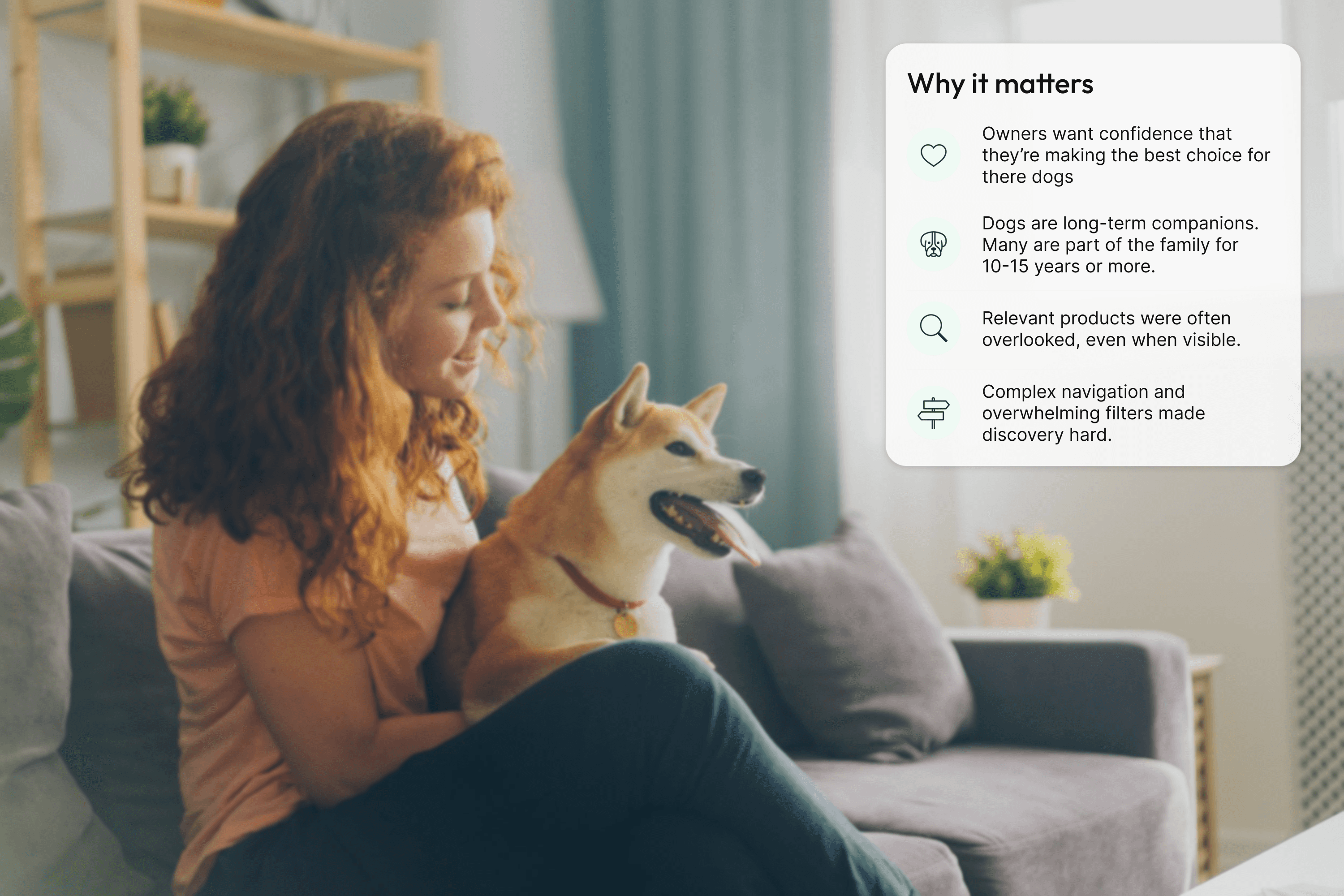
Choosing pet food isn't just about shopping. It's caring for a family member.
Dogs become part of the family for 10-15 years or more. Every choice we make affects their health, happiness and quality of life.
Through interviews, eye tracking and card sorting exercises, I discovered that users weren’t struggling to choose between products.
They were struggling to confidently find the right ones.
02
Problem space
Choosing pet food isn't just about shopping. It's caring for a family member.
Dogs become part of the family for 10-15 years or more. Every choice we make affects their health, happiness and quality of life.
Through interviews, eye tracking and card sorting exercises, I discovered that users weren’t struggling to choose between products.
They were struggling to confidently find the right ones.
02
Problem space
Choosing pet food isn't just about shopping. It's caring for a family member.
Dogs become part of the family for 10-15 years or more. Every choice we make affects their health, happiness and quality of life.
Through interviews, eye tracking and card sorting exercises, I discovered that users weren’t struggling to choose between products.
They were struggling to confidently find the right ones.
03
Research & Discovery
Understanding why finding the right product felt so difficult.
Research approach
To understand where users struggled, I combined eye-tracking, interviews, card sorting and usability testing.
This helped uncover not only where users experienced friction, but why they felt uncertain when choosing products for their dogs.
Research snapshot

5 Eye tracking sessions

10 User interviews

5 Card sort exercises

15 Usability testing sessions
How I explored the experience
01

Understanding product discovery
Explore how users navigate, browse and narrow product options on the website.
Methods used

Eye tracking

Usability testing
02

Understanding decision making
Explore how users evaluate and compare products before choosing what's right.
Methods used

Interviews

Think aloud testing
03

Evaluating information architecture
Understand how users expect information to be organised and grouped
Methods used
Card sorting

Navigation testing
04

Identifying checkout uncertainty
Explore how subscription and delivery options influence confidence at checkout.
Methods used

Usability testing
interviews
What I discovered

01
Products were difficult to find
Eye-tracking sessions revealed that users focused on navigation and filters rather than product listings.
Relevant products were frequently overlooked.

02
Filters created decision fatigue
Over 100 filter options made it difficult for users to understand which criteria were most important.
Users wanted guidance rather than more choices.

03
Finding products wasn't' intuitive
Card sorting exercises showed that users grouped information differently from the existing site structure.
Finding the right category required extra steps.

04
Purchase options caused confusion
Users often confuse one-time purchases with repeat delivery options, risking unintended future orders.
This created hesitation during product selection.
Key findings
Four key behaviour patterns emerged across participants that influence decisions at every stage of the journey.

01
Discovery required effort
Users relied heavily on navigation and filters to find relevant products, making discovery more difficult than expected.
02
Choice increased uncertainty
Similar products and numerous filter options made comparison harder and increased decision fatigue.
03
Categories mismatched expectations
Card sorting showed that the existing structure didn't reflect how users naturally grouped and searched for products.

04
Buying options caused hesitation
Delivery formats, subscriptions and one-off purchases introduced uncertainty at the point of decision.
I just want to know I'm choosing the right food for them.
- Interview participant
Interviews revealed that a lack of products didn’t cause uncertainty. Users wanted reassurance that they were making the right decision for a family member they deeply cared about.

03
Research & Discovery
Understanding why finding the right product felt so difficult.
Research approach
To understand where users struggled, I combined eye-tracking, interviews, card sorting and usability testing.
This helped uncover not only where users experienced friction, but why they felt uncertain when choosing products for their dogs.
Research snapshot
5 Eye tracking sessions
10 User interviews
5 Card sort exercises
15 Usability testing sessions
How I explored the experience
01
Understanding product discovery
Explore how users navigate, browse and narrow product options on the website.
Methods used
Eye tracking
Usability testing
02
Understanding decision making
Explore how users evaluate and compare products before choosing what's right.
Methods used
Interviews
Think aloud testing
03
Evaluating information architecture
Understand how users expect information to be organised and grouped
Methods used
Card sorting
Navigation testing
04
Identifying checkout uncertainty
Explore how subscription and delivery options influence confidence at checkout.
Methods used
Usability testing
interviews
What I discovered
01
Products were difficult to find
Eye-tracking sessions revealed that users focused on navigation and filters rather than product listings.
Relevant products were frequently overlooked.
02
Filters created decision fatigue
Over 100 filter options made it difficult for users to understand which criteria were most important.
Users wanted guidance rather than more choices.
03
Finding products wasn't' intuitive
Card sorting exercises showed that users grouped information differently from the existing site structure.
Finding the right category required extra steps.
04
Purchase options caused confusion
Users often confuse one-time purchases with repeat delivery options, risking unintended future orders.
This created hesitation during product selection.
Key findings
Four key behaviour patterns emerged across participants that influence decisions at every stage of the journey.
01
Discovery required effort
Users relied heavily on navigation and filters to find relevant products, making discovery more difficult than expected.
02
Choice increased uncertainty
Similar products and numerous filter options made comparison harder and increased decision fatigue.
03
Categories mismatched expectations
Card sorting showed that the existing structure didn't reflect how users naturally grouped and searched for products.
04
Buying options caused hesitation
Delivery formats, subscriptions and one-off purchases introduced uncertainty at the point of decision.
I just want to know I'm choosing the right food for them.
- Interview participant
Interviews revealed that a lack of products didn’t cause uncertainty. Users wanted reassurance that they were making the right decision for a family member they deeply cared about.
03
Research & Discovery
Understanding why finding the right product felt so difficult.
Research approach
To understand where users struggled, I combined eye-tracking, interviews, card sorting and usability testing.
This helped uncover not only where users experienced friction, but why they felt uncertain when choosing products for their dogs.
Research snapshot
5 Eye tracking sessions
10 User interviews
5 Card sort exercises
15 Usability testing sessions
How I explored the experience
01
Understanding product discovery
Explore how users navigate, browse and narrow product options on the website.
Methods used
Eye tracking
Usability testing
02
Understanding decision making
Explore how users evaluate and compare products before choosing what's right.
Methods used
Interviews
Think aloud testing
03
Evaluating information architecture
Understand how users expect information to be organised and grouped
Methods used
Card sorting
Navigation testing
04
Identifying checkout uncertainty
Explore how subscription and delivery options influence confidence at checkout.
Methods used
Usability testing
interviews
What I discovered
01
Products were difficult to find
Eye-tracking sessions revealed that users focused on navigation and filters rather than product listings.
Relevant products were frequently overlooked.
02
Filters created decision fatigue
Over 100 filter options made it difficult for users to understand which criteria were most important.
Users wanted guidance rather than more choices.
03
Finding products wasn't' intuitive
Card sorting exercises showed that users grouped information differently from the existing site structure.
Finding the right category required extra steps.
04
Purchase options caused confusion
Users often confuse one-time purchases with repeat delivery options, risking unintended future orders.
This created hesitation during product selection.
Key findings
Four key behaviour patterns emerged across participants that influence decisions at every stage of the journey.
01
Discovery required effort
Users relied heavily on navigation and filters to find relevant products, making discovery more difficult than expected.
02
Choice increased uncertainty
Similar products and numerous filter options made comparison harder and increased decision fatigue.
03
Categories mismatched expectations
Card sorting showed that the existing structure didn't reflect how users naturally grouped and searched for products.
04
Buying options caused hesitation
Delivery formats, subscriptions and one-off purchases introduced uncertainty at the point of decision.
I just want to know I'm choosing the right food for them.
- Interview participant
Interviews revealed that a lack of products didn’t cause uncertainty. Users wanted reassurance that they were making the right decision for a family member they deeply cared about.
04
Design direction and strategy
Designing a clearer, more confident path to the right product.
Research revealed that uncertainty, too many option and unfamiliar navigation patterns made it hard for pet owners to find and choose the right products for their pets.
I turned these insights into clear design principles that shaped every decision.

Design principles
01
Help users find products faster
Reduce unnecessary complexity and surface the most relevant products sooner.
02

Reduce product choice overload
Present information progressively and make comparisons simple and manageable.
03

Match how people naturally shop
Structure navigation and categories according to how pet owners think and search.
04

Support confident decisions
Provide reassurance at key moments to help users feel good about their choices.
04
Design direction and strategy
Designing a clearer, more confident path to the right product.
Research revealed that uncertainty, too many option and unfamiliar navigation patterns made it hard for pet owners to find and choose the right products for their pets.
I turned these insights into clear design principles that shaped every decision.
Design principles
01
Help users find products faster
Reduce unnecessary complexity and surface the most relevant products sooner.
02
Reduce product choice overload
Present information progressively and make comparisons simple and manageable.
03
Match how people naturally shop
Structure navigation and categories according to how pet owners think and search.
04
Support confident decisions
Provide reassurance at key moments to help users feel good about their choices.
04
Design direction and strategy
Designing a clearer, more confident path to the right product.
Research revealed that uncertainty, too many option and unfamiliar navigation patterns made it hard for pet owners to find and choose the right products for their pets.
I turned these insights into clear design principles that shaped every decision.
Design principles
01
Help users find products faster
Reduce unnecessary complexity and surface the most relevant products sooner.
02
Reduce product choice overload
Present information progressively and make comparisons simple and manageable.
03
Match how people naturally shop
Structure navigation and categories according to how pet owners think and search.
04
Support confident decisions
Provide reassurance at key moments to help users feel good about their choices.
05
Translating strategy into experience
Turning insights into a simpler shopping experience.
The research highlighted key moments where pet owners felt friction or uncertainty.
I applied four design principles to optimise these moments and create a smoother more confident shopping experience.

The optimised shopping journey
Research findings were translated into improvements across four key stages of the customer journey.
Discover
Help users find relevant products more quickly.


Decide
Support informed decisions through clearer information.


Compare
Help users compare products with confidence.

Purchase
Reduce uncertainty around delivery and checkout.


A clearer journey from discovery to checkout
Each improvement works together to reduce friction, simplify descripitons and create a more confident experience for pet owners.
05
Translating strategy into experience
Turning insights into a simpler shopping experience.
The research highlighted key moments where pet owners felt friction or uncertainty.
I applied four design principles to optimise these moments and create a smoother more confident shopping experience.
The optimised shopping journey
Research findings were translated into improvements across four key stages of the customer journey.
Discover
Help users find relevant products more quickly.
Compare
Help users compare products with confidence.
Decide
Support informed decisions through clearer information.
Purchase
Reduce uncertainty around delivery and checkout.
A clearer journey from discovery to checkout
Each improvement works together to reduce friction, simplify descripitons and create a more confident experience for pet owners.
05
Translating strategy into experience
Turning insights into a simpler shopping experience.
The research highlighted key moments where pet owners felt friction or uncertainty.
I applied four design principles to optimise these moments and create a smoother more confident shopping experience.
The optimised shopping journey
Research findings were translated into improvements across four key stages of the customer journey.
Discover
Help users find relevant products more quickly.
Compare
Help users compare products with confidence.
Decide
Support informed decisions through clearer information.
Purchase
Reduce uncertainty around delivery and checkout.
A clearer journey from discovery to checkout
Each improvement works together to reduce friction, simplify descripitons and create a more confident experience for pet owners.
06
Bringing the journey together
A connected experience from discovery to checkout.
Each screen was designed to reduce friction, improve clarity and support pet owners at every step of their journey.
Here are 8 key screens that work together to create a seamless experience.
01
Homepage
Clear entry point, offers and content help users quickly find relevant products and information quickly.

02
Navigation mega menu
Reorganised categories and navigation make it easier for users to find products quickly.

03
Puppies landing page
Dedicated puppy categories and guidance help new puppy owners find relevant products faster.

04
Product listings
Improved filters and product information make it easier to browse, compare and narrow options.

05
Product details page
Clear information, benefits and feeding guidance help users choose the right food.

06
Add to basket
Clear purchase options and recommendations help users make informed decisions before adding products to their basket.

07
Add to basket
Clear pricing, delivery information and basket controls help users review their purchase with confidence.

08
Checkout
Flexible checkout options allow users to continue as a guest or sign in, reducing friction and supporting different purchasing preferences.

Helping pet owners shop with confidence
Each improvement works together to create a more intuitive shopping experience, helping pet owners find relevant products, make informed choices and complete their purchase with confidence.
06
Bringing the journey together
A connected experience from discovery to checkout.
Each screen was designed to reduce friction, improve clarity and support pet owners at every step of their journey.
Here are 8 key screens that work together to create a seamless experience.
01
Homepage
Clear entry point, offers and content help users quickly find relevant products and information quickly.
02
Navigation mega menu
Reorganised categories and navigation make it easier for users to find products quickly.
03
Puppies landing page
Dedicated puppy categories and guidance help new puppy owners find relevant products faster.
04
Product listings
Improved filters and product information make it easier to browse, compare and narrow options.
05
Product details page
Clear information, benefits and feeding guidance help users choose the right food.
06
Add to basket
Clear purchase options and recommendations help users make informed decisions before adding products to their basket.
07
Add to basket
Clear pricing, delivery information and basket controls help users review their purchase with confidence.
08
Checkout
Flexible checkout options allow users to continue as a guest or sign in, reducing friction and supporting different purchasing preferences.
Helping pet owners shop with confidence
Each improvement works together to create a more intuitive shopping experience, helping pet owners find relevant products, make informed choices and complete their purchase with confidence.
06
Bringing the journey together
A connected experience from discovery to checkout.
Each screen was designed to reduce friction, improve clarity and support pet owners at every step of their journey.
Here are 8 key screens that work together to create a seamless experience.
01
Homepage
Clear entry point, offers and content help users quickly find relevant products and information quickly.
02
Navigation mega menu
Reorganised categories and navigation make it easier for users to find products quickly.
03
Puppies landing page
Dedicated puppy categories and guidance help new puppy owners find relevant products faster.
04
Product listings
Improved filters and product information make it easier to browse, compare and narrow options.
05
Product details page
Clear information, benefits and feeding guidance help users choose the right food.
06
Add to basket
Clear purchase options and recommendations help users make informed decisions before adding products to their basket.
07
Add to basket
Clear pricing, delivery information and basket controls help users review their purchase with confidence.
08
Checkout
Flexible checkout options allow users to continue as a guest or sign in, reducing friction and supporting different purchasing preferences.
Helping pet owners shop with confidence
Each improvement works together to create a more intuitive shopping experience, helping pet owners find relevant products, make informed choices and complete their purchase with confidence.
07
Validation & refinement
Every improvement focused on what matters most
User research and usability testing helped identify the key areas that were creating friction by reframing these moments, the experience becomes clearer, simpler and more reassuring for pet owners
Testing at a glance
1 Wireframe design prototype
testing key stages of the shopping experience.

3 iterative design refinements
Each round built on previous user feedback.

5 usability tests per iteration
Participants completed key tasks across the journey.

Think aloud protocol & interviews
Revealing the reasoning behind users choices and behaviours.
Key improvements
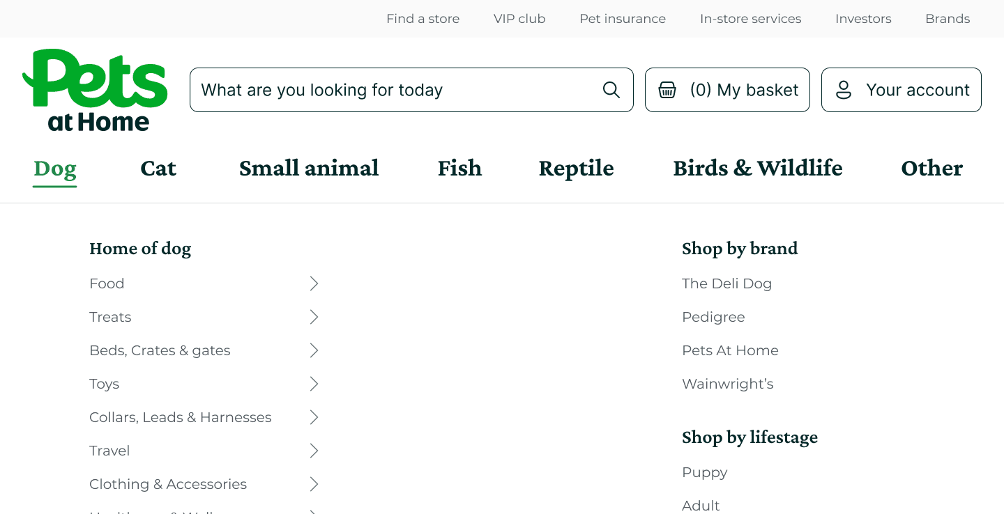

Navigation structure
Insight
Users struggled to understand where products and advice content were located.
My response

Reorganised categories
Clearer hierarchy
clearer navigation structure


Filter optimisation
Insight
Users wanted to narrow large product ranges more efficiently.
My response
Prioritised common filters
Grouped related options
Reduced complexity


Product understanding
Insight
Users needed clearer information and reassurance before making a purchase.
My response
Improved feeding guidance
Enhanced reviews
Clearer product benefits


Checkout clarity
Insight
Users wanted greater clarity and reassurance before completing their purchase.
My response
Transparent pricing
Delivery information
Flexible checkout options
Refining the experience through feedback
Each iteration revealed new opportunities to simplify the journey, helping shape a more intuitive experience that better supports users from discovery through to purchase.
07
Validation & refinement
Every improvement focused on what matters most
User research and usability testing helped identify the key areas that were creating friction by reframing these moments, the experience becomes clearer, simpler and more reassuring for pet owners
Testing at a glance
1 Wireframe design prototype
testing key stages of the shopping experience.
3 iterative design refinements
Each round built on previous user feedback.
5 usability tests per iteration
Participants completed key tasks across the journey.
Think aloud protocol & interviews
Revealing the reasoning behind users choices and behaviours.
Key improvements
Navigation structure
Insight
Users struggled to understand where products and advice content were located.
My response
Reorganised categories
Clearer hierarchy
clearer navigation structure
Filter optimisation
Insight
Users wanted to narrow large product ranges more efficiently.
My response
Prioritised common filters
Grouped related options
Reduced complexity
Product understanding
Insight
Users needed clearer information and reassurance before making a purchase.
My response
Improved feeding guidance
Enhanced reviews
Clearer product benefits
Checkout clarity
Insight
Users wanted greater clarity and reassurance before completing their purchase.
My response
Transparent pricing
Delivery information
Flexible checkout options
Refining the experience through feedback
Each iteration revealed new opportunities to simplify the journey, helping shape a more intuitive experience that better supports users from discovery through to purchase.
07
Validation & refinement
Every improvement focused on what matters most
User research and usability testing helped identify the key areas that were creating friction by reframing these moments, the experience becomes clearer, simpler and more reassuring for pet owners
Testing at a glance
1 Wireframe design prototype
testing key stages of the shopping experience.
3 iterative design refinements
Each round built on previous user feedback.
5 usability tests per iteration
Participants completed key tasks across the journey.
Think aloud protocol & interviews
Revealing the reasoning behind users choices and behaviours.
Key improvements
Navigation structure
Insight
Users struggled to understand where products and advice content were located.
My response
Reorganised categories
Clearer hierarchy
clearer navigation structure
Filter optimisation
Insight
Users wanted to narrow large product ranges more efficiently.
My response
Prioritised common filters
Grouped related options
Reduced complexity
Product understanding
Insight
Users needed clearer information and reassurance before making a purchase.
My response
Improved feeding guidance
Enhanced reviews
Clearer product benefits
Checkout clarity
Insight
Users wanted greater clarity and reassurance before completing their purchase.
My response
Transparent pricing
Delivery information
Flexible checkout options
Refining the experience through feedback
Each iteration revealed new opportunities to simplify the journey, helping shape a more intuitive experience that better supports users from discovery through to purchase.
08
Reflection & key takeaways
Supporting every stage of the shopping journey.
The project reinforced the importance of looking beyond individual screens and understanding how each stage of a journey connects together.
Small improvements to navigation, filtering, product information and checkout combined to create a more intuitive shopping experience for pet owners.

Reflection
Small improvements create meaningful outcomes.
While no single change transformed the experience, each refinement addressed a specific user need. By focusing on the moments that created uncertainty, the final experience became easier to navigate, easier to understand and easier to complete.

User-centred decisions
Every change was driven by real user feedback and behaviour.

Evidence-led improvements
Usability testing helped identify friction and validate solutions.

Impact through iteration
Multiple rounds of testing helped prioritise the changes that mattered most.

A better experience for pets and their owners
Making the journey simpler and clearer helped pet owners find what they need with confidence.
08
Reflection & key takeaways
Supporting every stage of the shopping journey.
The project reinforced the importance of looking beyond individual screens and understanding how each stage of a journey connects together.
Small improvements to navigation, filtering, product information and checkout combined to create a more intuitive shopping experience for pet owners.
Reflection
Small improvements create meaningful outcomes.
While no single change transformed the experience, each refinement addressed a specific user need. By focusing on the moments that created uncertainty, the final experience became easier to navigate, easier to understand and easier to complete.
User-centred decisions
Every change was driven by real user feedback and behaviour.
Evidence-led improvements
Usability testing helped identify friction and validate solutions.
Impact through iteration
Multiple rounds of testing helped prioritise the changes that mattered most.
A better experience for pets and their owners
Making the journey simpler and clearer helped pet owners find what they need with confidence.
08
Reflection & key takeaways
Supporting every stage of the shopping journey.
The project reinforced the importance of looking beyond individual screens and understanding how each stage of a journey connects together.
Small improvements to navigation, filtering, product information and checkout combined to create a more intuitive shopping experience for pet owners.
Reflection
Small improvements create meaningful outcomes.
While no single change transformed the experience, each refinement addressed a specific user need. By focusing on the moments that created uncertainty, the final experience became easier to navigate, easier to understand and easier to complete.
User-centred decisions
Every change was driven by real user feedback and behaviour.
Evidence-led improvements
Usability testing helped identify friction and validate solutions.
Impact through iteration
Multiple rounds of testing helped prioritise the changes that mattered most.
A better experience for pets and their owners
Making the journey simpler and clearer helped pet owners find what they need with confidence.
Looking for your next product designer?



Thoughtfully designed by Adam Ridges
Looking for your next product designer?
Thoughtfully designed by Adam Ridges
Looking for your next product designer?
Thoughtfully designed by Adam Ridges